
GRAPHIC DESIGN

FIGURE & GROUND
graphic design: perceptions | project one
OBJECTIVE:
Your task is to morph the figure and ground relationship from Clear Figure on Ground through 3 stages of Figure Becoming Ground to Figure and Ground Reversal, another 3 stages of Figure Becoming Ground, and finally to Clear Figure on Ground again. Create visually even, progressive changes between each step.
Essentially, you are telling a story. In fact, you are always telling a story of some kind. The story here is starts with a figure shape that is clearly recognizable and nameable. That figure is what gradually changes—logically and sequentially—to a halfway point in the story where both itself and the ground surrounding it are equally visually important—neither is more nameable. Then, from this middle step, the story continues morphing with the ground now becoming sequentially more important. Finally, the story ends in the last step with a clear figure that is the opposite color of the very first step—a figure ground reversal.
For some reason, I really struggled with this project. I'm not sure if it's because it was my first design project of the semester and my brain needed some warming up. I had difficulty connecting the letter and number with the middle tile and making a clear figure and ground transformation. Despite my struggles, this project did help me see how important figure and ground is in design.

part one version one

part one version two

part two version two
part one version one
VERSIONS ONE AND TWO

part three final version

part three printed
part three final version
GRID COMPOSITIONS
graphic design: perceptions | project two
OBJECTIVE:
Essentially, you are always telling a visually story. The simplest of those stories may be told using geometric shapes and no color. The arrangement or composition of those shapes therefore becomes essential in the success of the story. In this case we will be concentrating on the use of a grid system, or lattice, as an approach to composition/layout. It is important to realize that for this assignment your are not creating a “picture”, but instead a “design” where Pattern is a prime concern or goal. The concept of Repetition with Variation is essential to creating an interesting pattern to create a sense of internal harmony, rhythm, contrast and movement.
-
Create a design based on (repetition with variation)—Pattern
-
Apply the Grid as a means of organization (size and location) of both objects and interval/white space
-
Create movement within the design
-
Create dynamic Figure and Ground Relationships
This project made more sense in my brain, so I was able to grasp the main concepts to create my final piece. The three step process did help me comprehend even further the concept of figure and ground. Making my final piece was fun because I treated it almost like a collage. It was helpful learning about using the grid to create a design as it helped me see how certain elements can connect.
FINAL VERSION


ICON SET
graphic design: perceptions | project three
OBJECTIVE:
Your task is to design a set of five symbols
-
That visually represent the main activities, locations, venues, etc. associated with your chosen area of interest.
-
That help visitors and employees positively experience the venue through directions, identification and location
-
That extend the Brand of the venue as a system of visual identification
At first making an icon set seemed really daunting. I wasn't sure if I would be able to come up with an entire set of icons. As the process started, I realized it wasn't as bad as I thought. Sketching and creating a mood board really helped me visualize this project. I enjoyed coming up with the color palette and design details. Overall, I am pretty satisfied with how my set came out.
2023 ICDE LOGO DESIGN COMPETITION GOLD MEDALIST
BRAND IDENTITY
graphic design: perceptions | project four
OBJECTIVE:
Your task is to design a set of five symbols
-
That visually represent the main activities, locations, venues, etc. associated with your chosen area of interest.
-
That help visitors and employees positively experience the venue through directions, identification and location
-
That extend the Brand of the venue as a system of visual identification
One thing I learned with many of my projects is that at first the task seems impossible and I don't know how I'm going to complete it. I had the same thought process with making this brand identity. Creating a whole identity for a made-up company seemed overwhelming. Like with my icon set, sketching out my ideas really helped me visualize what I might want to do. Once I got my main sketches down, creating the rest came into place. I learned a lot about the nuances of making a logo and what kind of information influences what is designed.


LOGO SKETCHES


LOGOS

wheels and gears stationary mock up

wheels and gears invoice mock up

wheels and gears sticker mock up
wheels and gears stationary mock up
MOCK UP DELIEVERABLES

APP PROTOTYPE
graphic design: perceptions | final project
OBJECTIVE:
In this assignment, your task is to build and test a working prototype . You will use principles of user experience (UX) design to create an interactive prototype. Interactive prototypes, while still not a finished design, allow UX designers to demo a fully functional user interactive experience, allowing for more meaningful and useful feedback from a client before committing the design to full production and engineering..
I've always wanted to try my hand at UX/UI design, so I was excited to have a project that focused on it. But making an app prototype in three weeks seemed overwhelming. For me the process of making the app was fun overall, there were some frustrating times though. It is really cool to see how much I learned during this project and how I went from knowing nothing about prototyping and using Figma to making an app prototype.


SKETCHES
LETTER COMPOSITION
intro to graphic design | project one
OBJECTIVE:
-
Develop an understanding of letter shapes
-
Use letters as design elements
-
Further your understanding of core design principles (i.e. size, direction, scale)
This project will make you aware of visual characteristics of different letters and of their relationships to each other and the space around them. It is a strictly black and white project. This means no grey. You will start with your type being black on white background.
Pick any 8 to 16 letters of your name and set them in a composition. Use both upper and lower case, at least one of each. You may combine different styles within the typeface.
Start developing your thumbnails first. Observe carefully the letters you want to work with. Look at proportions, positive and negative spaces, shape of the serifs. Layer the letters to form a visually intriguing design. The letters can overlap, combine, their intersections can be reversed. You can flip a letter, rotate it. Experiment with shifting sizes, different letters and number of letters. The letters do not have to be legible. Start drawing the thumbnails.
Please be sensitive to the size of the letters and the white space around them. You do not have to cover the page completely. Although nothing can go outside the design square, a part of the letter can be cut off at the edge of the design square.
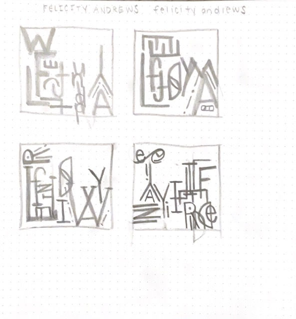
While working on this project, I enjoyed figuring out the patterns and how the letters fit together. I wanted to experiment with how different styles of typefaces look and fit together, which is why I made two compositions. While it was difficult at times to create an interesting compositions, this project allowed me to think more outside of the box, going away from my typical clean and organized design style.


REFERENCE PHOTO


GRAPHIC TRANSLATION
intro to graphic design | project two
OBJECTIVE:
Translate an image through a series of steps or gradations in value from light to dark. You can only use black or white, no gray or color allowed.
-
Make four separate translations
-
Each translation should be treated as a separate image, different from any of the others. Yet all images should belong together as a series which progresses from light to dark.
-
Make use of the following as ways of manipulating changes in the image
-
Implied line
-
Positive/negative shape
-
Contour
-
Shadow and highlight shapes
-
Variations in line weight
-
Figure/ground relationships
-
Gestalt principles
-
-
The image should progressively change by equal amounts of light or dark between each step of the series
Your goal is to capture the essence of the object within the context of very specific guidelines which you establish for each step.
Your ability to capture and translate the quality of reflection, shadow and highlight is key to your success. This means that shadows, highlights and reflections do not have to remain in the same position on the object as originally seen. You may move those light shapes around according to the resulting balance of the overall design. You are a visual editor, allowing certain shapes to remain, to be moved, or to delete them. Your subject is always light.
For this project, I struggled with the transitions quite a but. I knew what needed to happen, but it was difficult for me to make it happen. I think the root of my troubles was that I anted to keep the delicate frame of the hummingbird in my transitions and not use large shapes as I thought it would overwhelm the bird.


HEAD ILLUSTRATIONS


HEAD PACKAGING
digital graphics and layouts | project one
OBJECTIVE:
Part One:
Create a head using the template; including the eyes, nose, ear, mouth etc. Add hair and a body to the head.
Part Two:
Choose a package template from the files. Create and design a package that will go with your head design. Add display and paragraph type to the design. Print and assemble the package.
Although I have used Illustrator before, this project allowed me to explore the tools more. The first part, the head, wasn't too difficult for me to complete once I got the hang of the pen tool. I was eager to start the second part, the packaging because I enjoy making tangible items. It was fun getting to learn how to make packaging and the thought and details that go into creating a design. I would like to explore package design further.


SKETCHES


SYMBOL SET
intro to graphic design | project three
OBJECTIVE:
Your task is to create a system of signs based upon four different words/concepts. Choose four words, two from each list, and create a symbol for each of them. Your goal is to capture the essence of each word as accurately, uniquely and concisely as possible. And all have to relate visually to the others.
Use only black and white, no color. Work graphically, not illustratively.
Finished size is 4”x4” each.
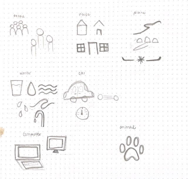
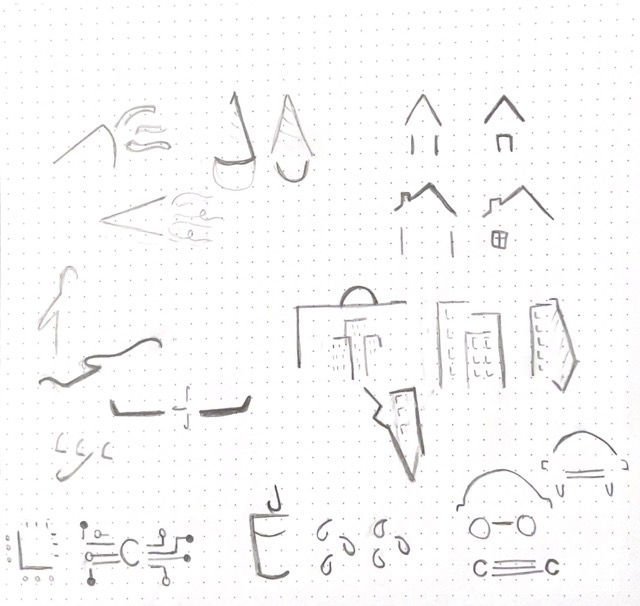
Since I had made a symbol/icon set in the fall, I wanted to challenge myself by trying a different design style than usual. With these icons, I wanted to explore using implied lines and a more light feelings. I achieved this by tapering the ends of the lines and by having no shape completely closed off. This style/technique also helped keep the icons cohesive as a set.


HEAD ILLUSTRATIONS


POSTERS
THREE HEADS
digital graphics and layouts | project two
OBJECTIVE:
In this assignment we will be exploring three different styles of drawing. Each of these styles will be a portrait of a different person—two highly recognizable/famous people + you (soon to be famous :)) Think of the two famous people as influences on you. You will be “tracing” their photographs as an initial step in the drawing process. Choose carefully which drawing style to apply to each of these people and also their pose and expression. (the styles are described below). The finished/final composition will be a grouping of all three of you so plan accordingly. Ask yourself, “What connections or meaning might you infer between the three by your choices of people, graphic style and overall arrangement—composition?” Your portrait is the only one that will be in color, so it will naturally demand a lot of attention by comparison with the other two drawings. Use this to your advantage as you decide on the placement of the three images in creating the final composition/grouping.
-
Step 1—high-contrast
-
Step2—posterization
-
Step 3—“scanner darkly”
Once your three files are completed you will put them together and add text. Your goal is to:
-
Create a unified Composition
-
Integrate the typography with the entire composition
-
Choose meaningful quotes where the words have a relationship/meaning to one another.
Completing this project definitely was time consuming, but it helped me learn more key commands and really pay attention to shapes of light. I was able to lean into implied lines with my high contrast image and comparing shades of light with my greyscale. I decided to use my brand colors as the main colors for the poster as a slight brand extensions of myself.
Creating the gif animation was a good refresher for me since I had created a gif before using Photoshop, but I forgot how to do it.


GIF ANIMATIONS


DUST JACKET


CANDLE PACKAGING
BOOK COVER & PACKAGE
advanced typography | project three part two
OBJECTIVE:
Book Jacket:
This step requires you to narrow your digital experiments in Illustrator and Photoshop down to 3 designs. Carefully analyze each design. Ask yourself “what are the design’s main characteristics”. You should come up with a short list of at least 6 characteristics for each design. These lists might include words such as; bold, mysterious, expressive, playful or candy-like, licorice-like, fence-like, etc. Then, taking your cue from these lists, decide on a category of book (mystery, adventure, love story, comedy, satire, etc.). Finally, match your design (based on its defining characteristics) to one of these book categories (genres) and either redesign the dust jacket/cover for an existing book or make up a title for a book that could be in that genre.
Layout your dust jacket design in Illustrator. Use sizes from a real book that you own. The final size of each panel depends upon the size of the book that you wrap. (you will be wrapping the final print around this book for you to photograph, so it must fit). Consider the possibilities of a wrap-around design (one that extends across front, spine and back panels).
Packing:
Look at your letterpress design and try to describe to yourself what are it’s characteristics. Once you have done that, the next step is to think of a product, company, object, concept or idea that would match up with that characteristic or visual look. At that point you should begin to think of the kind of box that might contain one of those things or something related to the company you have imagined.
Experimenting with the wood type was fun, but also challenging. I found it difficult to create patterns because once it was down on paper, it was there permanently, so it was a little daunting creating patterns. Although I created a slew of patterns, I wasn't really satisfied with any of them. Despite that, I took the stamped letters into Illustrator and began experimenting with them see what I could create. I knew that I wanted to create both a dust jacket and a package to expand my skillset and knowledge in both areas.
I decided to base both design on "These Violent Delights" by Chloe Gong. I wanted to emphasize and show that the book is set in the 1920's by using an art deco style. I decided to create a candle package since it is popular for some small shops to create candles based on books for readers to enjoy.


SOCIAL COMMENTARY
intro to graphic design | final project
OBJECTIVE:
• To convey content through use of text and image
• To experience the power of communication
• To create a final narrative form that embraces your content in every manner
possible - to make your work concrete
• To use of color as expressive means
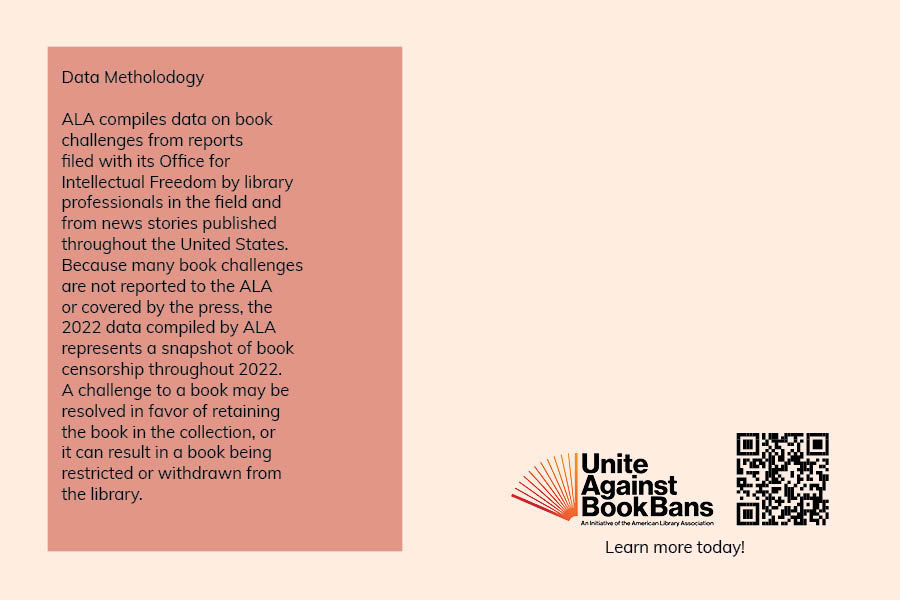
To complete this assignment, you must design a solution to address a social, environmental, political, or cultural issue that you care about. You can use any material to create your design, but it must be of high quality. The project can be done on a computer or by hand. Original images are preferred, but found images are acceptable as long as they are altered. The text accompanying your images should not be an afterthought and must be an integral part of your design.




BOARD GAME
branding and advertising | project one
OBJECTIVE:
In this assignment, you will work with a game design team to create a visual identity system for a game. You will work with the game design team from the beginning to shape the game's idea, and your responsibilities include creating a name and logo for the game, designing the box, and creating a rulebook template. You will also design an advertising campaign of three advertisements promoting the game. You will be responsible for developing your own solution of the identity/box/rulebook, and you can collaborate with the other designer on developing a design brief and coming up with a brand name. Within the Design team, you will elect a leader who will be responsible for communicating with your Game Design and Marketing counterparts. Your design brief might change as the game gets more developed, but it will get you something to start with. You will also research existing board and card games, decide who your target market is, and come up with a catchy name and give the game a unique character.
Create a campaign: it means that these advertisements work together so you have to come up with three related ideas, not just tweak one and apply it to different media/formats. Please take the ads further than just displaying the boxes or logos on the page.


ORIGINAL PACKAGING


INTERNATIONAL MARKETING
branding and advertising | project two
OBJECTIVE:
-
Apply design methodology to work for an actual client
-
Develop an understanding of the ways in which marketing research, target audiences, and user profiles affect the design process.
-
Understand the basics of how marketing strategy is developed, updated, and expanded.
-
Identify basic marketing terms and concepts.
-
Develop an understanding of methods for presenting designs to clients.
In collaboration with the BUSI 165 International Marketing class, 3 designers will be assigned to each marketing team to create visual materials for a marketing plan for new products from International Flour Mills in Trinidad. Each designer will create 2-3 deliverables. This collaboration will give designers experience in collaboration across disciplines and working within a group setting. Meetings will be required outside of class for feedback and direction.